An accessible solution for a fintech ready for any enterprise
- Team
- NTT DATA
- Tangity
- Banca AideXa
- Studios
- Milan
Banca AideXa has asked us to design a modular and scalable website solution, in line with the current design trends. The website had to be 100% accessible, it had to speak the language of the reader and being able to engage the user through a UI design that was neither that of a traditional bank nor that of a fintech. Furthermore, we've been asked to design a Content Management System that would allow the client to manage the website independently.
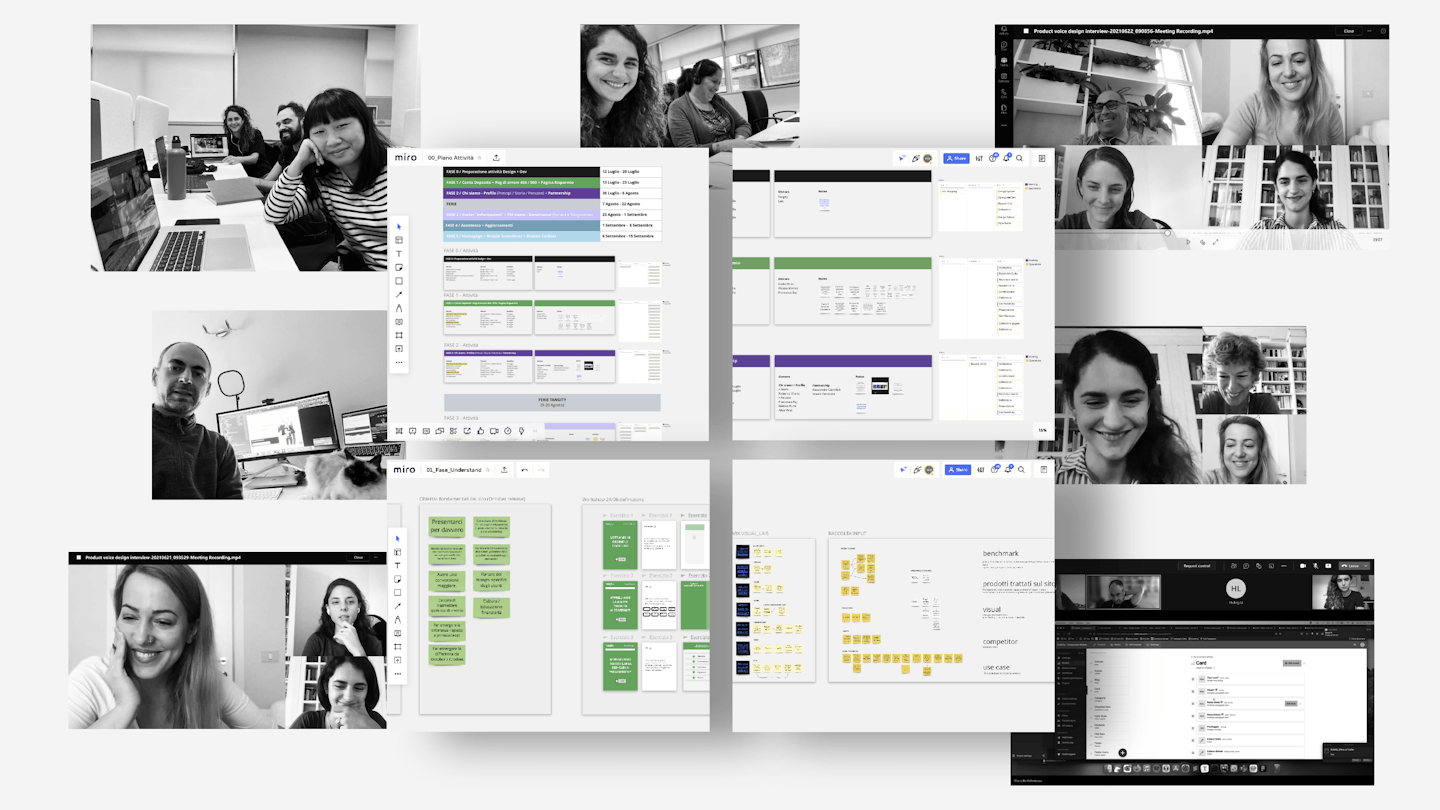
We arrived when AideXa became a bank. Our work, therefore, from the very start, had one goal: to help the brand to determine itself. The secrets of our methodology? Planning, organization, synergy, agility.
At the beginning of the project, we planned activities, and we immediately started working together with the client stakeholders, taking into consideration everyone's points of view: business, content, design, visual, development. The tight organization of the team gave the project the necessary foresight. We started off with designing the website voice.
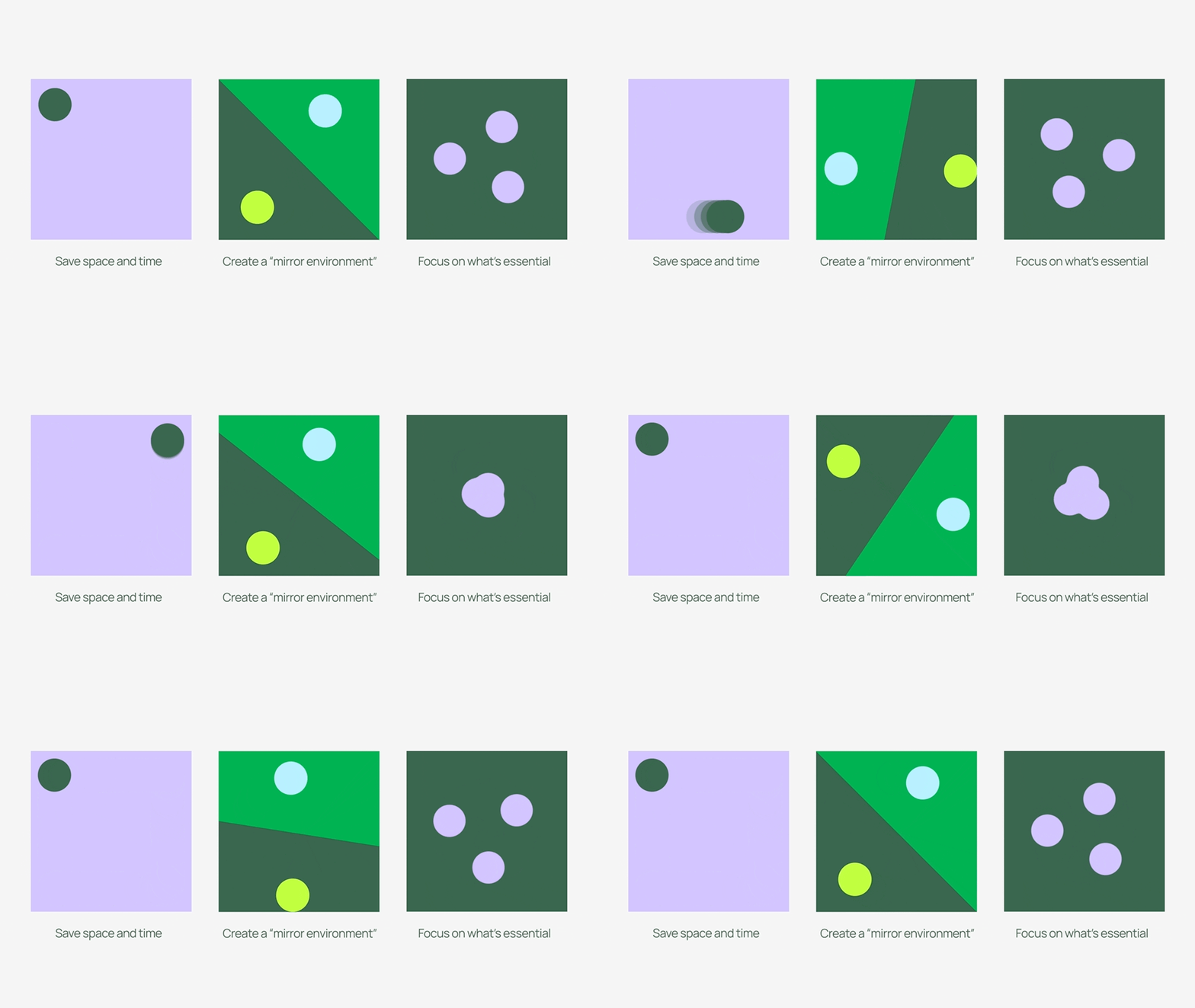
During the design process, instead, we created a design system. Synergistically, we worked together to achieve a common goal, relying on the complicity of a very present customer and relying on the great team harmony that has always been between us. We were all hands-on, driven by the great desire to design by iterating.
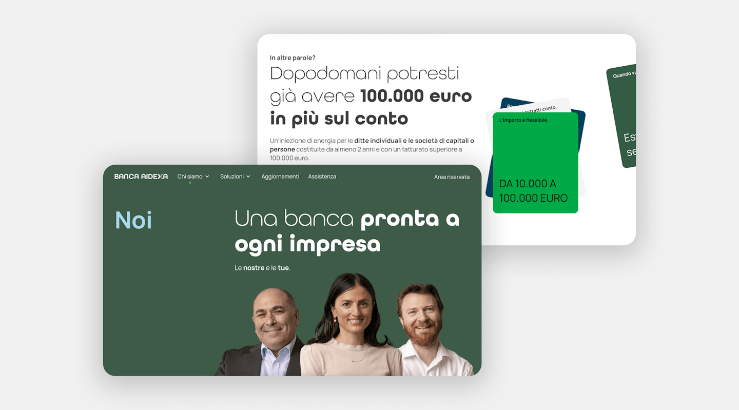
"The results of the partnership with Tangity have been extremely satisfying. AideXa.it is now a place that fully reflects who we are: a bank ready for any business. The secret to success lies in the team’s strong skills, proactivity, and the ability to understand the needs of AideXa and its customers fully."
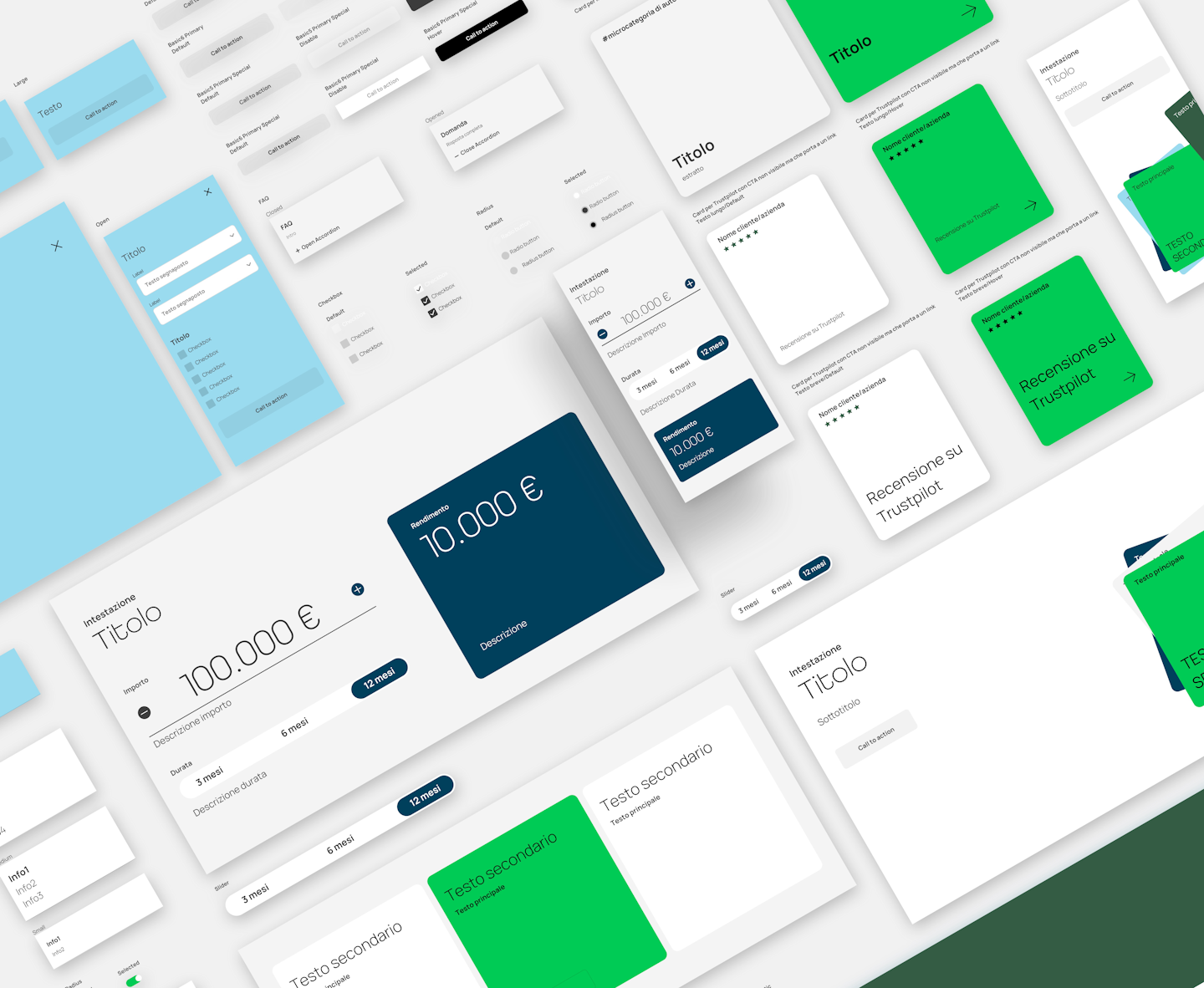
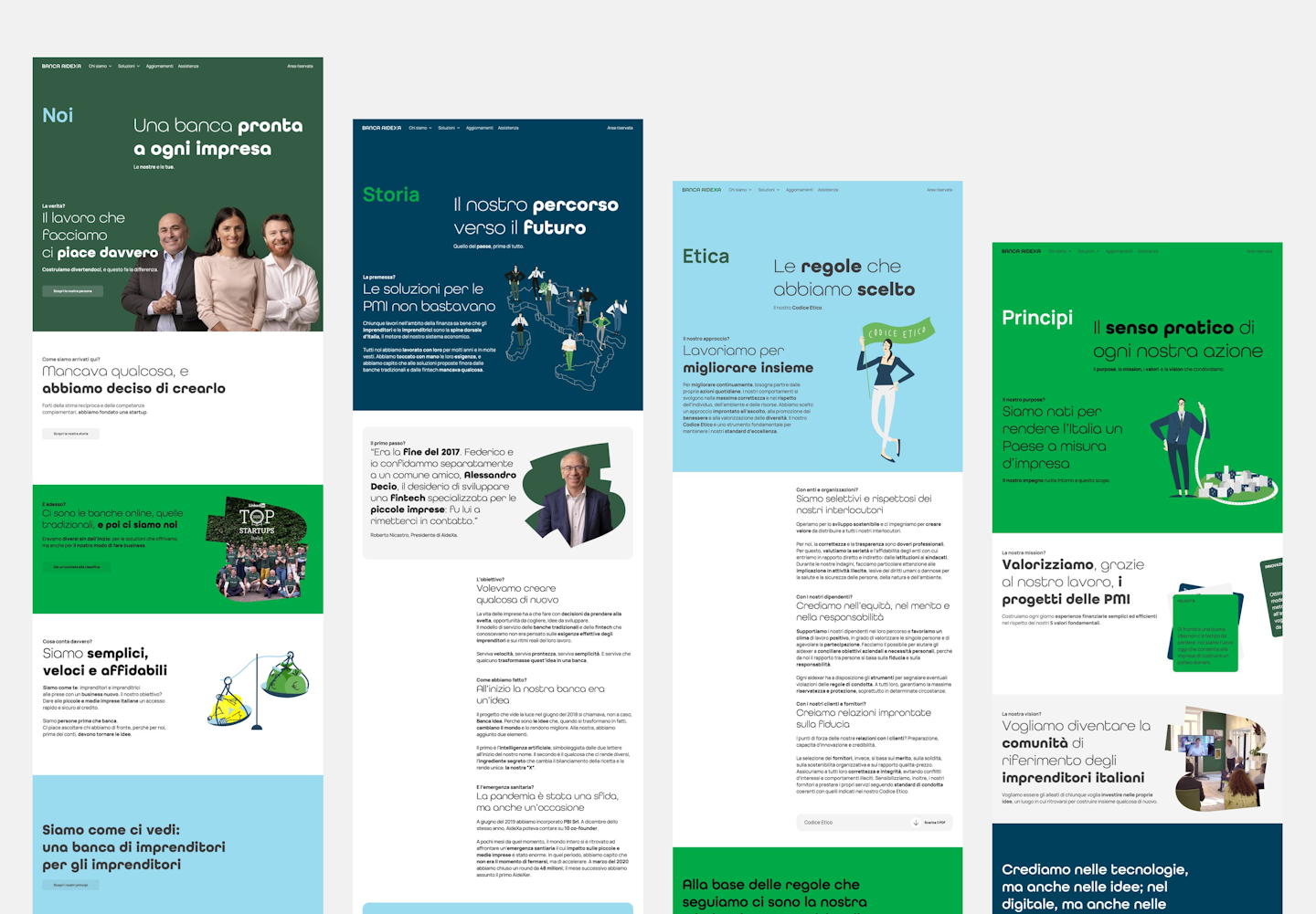
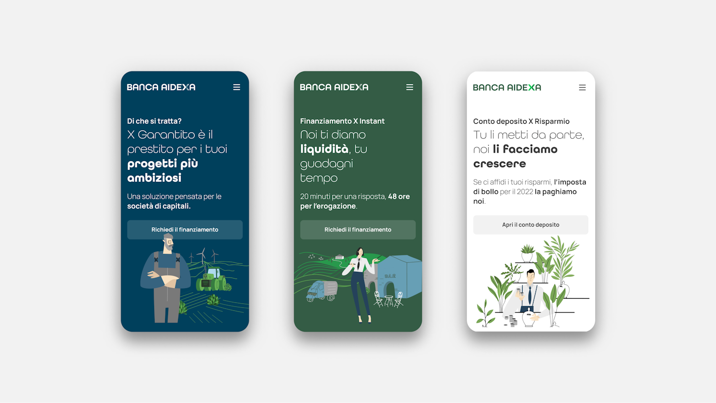
Banca AideXa's new corporate website has now a modular and scalable UI design and structure. Each page content is designed to simulate the dialogue between the customer and the bank, with the aim of helping the user to feel involved. To engage the reader, a series of illustrations prepared ad hoc accompany the story that the page copy and microcopy already tell. Navigation is simple and straightforward. The Content Management System is easy to use and allows data enterers to quickly build new pages. The design system allows anyone to understand and borrow the logic and strategy to apply during the design and development of new components or layouts.
Awards
Corporate Website
Modules
+ 25 variants
Involvement
stakeholders
Team
Designers and developers
Hungry for more?